
Call To Action
What is a Call to Action (CTA)? (The “Ask” That Makes Money)
Let’s talk about the entire reason your website exists.
It’s not just to look pretty. Your website has a job. And to do that job, it has to ask people to do things. That “ask” is the Call to Action, or “CTA” for short.
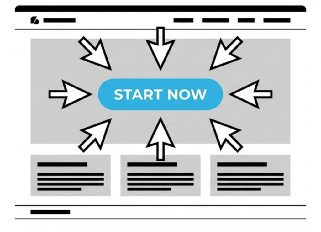
A CTA is exactly what it sounds like: a prompt on your website that tells the user to take a specific, desired action. It’s the “Get Started,” the “Buy Now,” or the “Get in Touch.” It’s the bridge between a passive visitor and an active customer.
Honestly? Getting the CTA right is the single most important part of Web Design. At Saint Digital, we believe a beautiful website that doesn’t convert is a failure.
Traffic is useless without conversion.
You can rank #1 on Google, but if your CTAs don’t work, you won’t make a penny. Learn how to turn SEO traffic into actual revenue in our beginner’s guide.
The Anatomy of a Great CTA
A “Call to Action” isn’t just a link. It’s a psychological tool. What separates a weak CTA from a powerful one?
1. It’s an Action-Packed Verb
Your CTA is a command. It has to be clear, strong, and start with a verb.
- Weak: “Submit,” “Click Here.” (Generic).
- Strong: “Get Your Free Quote,” “Start Your Trial.” (Promises a clear outcome).
2. It’s Visually Obvious (The Design Part)
If your user can’t find your CTA in 3 seconds, it doesn’t exist.
- Contrasting Colour: It shouldn’t blend in. It needs to “pop.”
- Whitespace: The button needs room to breathe. Whitespace makes it a focal point.
- Placement: Place it “Above the Fold” and in the top-right of your Menu.
3. The Secret Weapon: Microcopy (Click Triggers)
Sometimes, a user wants to click, but they are anxious. “Will this cost money?”
Microcopy is tiny text placed under the button to remove anxiety (e.g., “No credit card required”). This simple sentence can increase conversion rates massively.
Primary vs. Secondary CTAs (The Hierarchy)
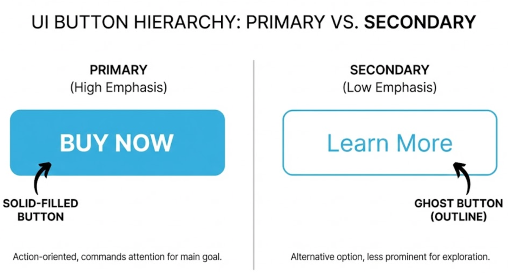
Here is a pro design tip: Not all buttons should look the same.
If every button is bright orange, the user gets overwhelmed (“Choice Paralysis”). You need a hierarchy.
- Primary CTA (Buy Now): Gets the solid, bright color.
- Secondary CTA (Learn More): Gets a “Ghost Button” style (transparent background).
This tells the user: “This is the main thing you should do, but here is a backup option.”
Technical Insight: A/B Testing Your CTAs
You can guess which button works best, or you can know. We use A/B Testing to find the winner.
We show 50% of users a Green button saying “Get Started,” and 50% of users an Orange button saying “Start Free Trial.” We track the clicks. The data often surprises us—sometimes a simple word change can boost sales by 20%.
Examples: The Bad, The Good, The Great
Let’s put it all together.
The Bad CTA
Click here to learn more.
(Boring. No value. Hard to find.)
The Good CTA
CONTACT US
(Better! It’s a button, but it’s generic.)
The Great CTA
GET YOUR FREE, NO-OBLIGATION QUOTE
(Perfect. I know exactly what I’m getting. It’s free. No risk.)
The Takeaway
Your Call to Action is the single most important element on your website. It’s not just a button; it’s the point of the whole exercise.
Designing a great CTA is an art. It’s about building a pathway for your user and confidently guiding them to the solution they’re looking for.
At Saint Digital, our web design services obsess over every button to make sure your site isn’t just a brochure, but a 24/7 sales engine.
Ready to convert?
Don’t just get visitors. Get customers.
A beautiful website is nice, but a beautiful website that converts is a business-changer. We at Saint Digital obsess over the psychology of the click. We design every button and every link to guide your user to their “next step.”
Ready to turn your website clicks into clients? Let’s have a chat.
Learn more from our Glossary
© Saint Digital Ltd, 2020-26, all rights reserved.