
Typography
What is Web Typography? (Why Your Font Choice Changes Everything)
You might think typography is just “picking a pretty font.”
But consider this: 95% of the information on the web is written language.
This means that 95% of your website’s design is, effectively, typography. If your type is hard to read, boring, or messy, your entire user experience fails. A user won’t buy from you if they can’t effortlessly read what you are selling.
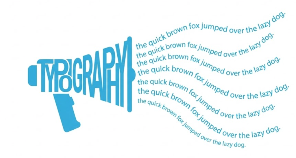
Welcome to the decoder ring. Typography is the art and technique of arranging type to make written language legible, readable, and appealing. It is the interface between your content and the user’s brain.
At Saint Digital, we treat typography as a core structural element. We don’t just pick fonts that look “cool.” We engineer typographic systems that guide the user’s eye, build your brand authority, and ensure your message lands with impact.
Is your design slowing you down?
Heavy font files and poor loading strategies damage your Core Web Vitals. Learn how to balance beautiful design with lightning-fast performance in our technical guide.
The Two Jobs of Typography: Brand & Usability
Typography has to do two conflicting things at once: it must express personality, but it must also be invisible enough to read effortlessly.
1. The Brand Job (The “Vibe”)
Typefaces have personalities. They communicate a feeling before the user reads a single word.
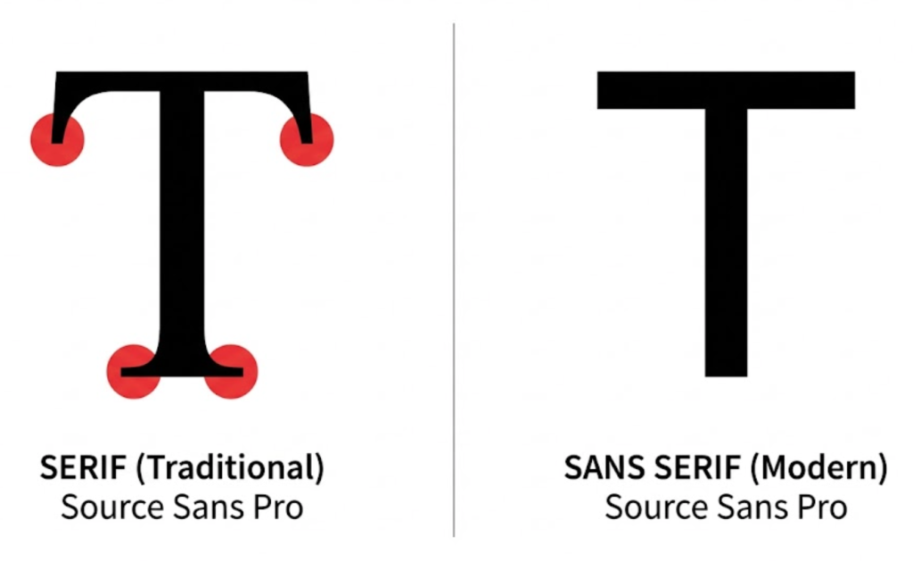
- Serif Fonts (e.g., Times New Roman, Georgia, Playfair): These have little “feet” on the ends of the letters. They feel traditional, trustworthy, authoritative, and expensive. (Think: The New York Times, Vogue, or a law firm).
- Sans-Serif Fonts (e.g., Arial, Helvetica, Roboto): These have no feet. They feel modern, clean, efficient, and tech-forward. (Think: Google, Airbnb, or a SaaS startup).
Choosing the wrong font creates a subconscious disconnect. If you are a cutting-edge AI startup using a dusty old Serif font, users will feel confused without knowing why.
The font we’re using at Saint Digital is Source Sans, which is quite malleable in that regard. We’ve used it to demonstrate the features of both serif and sans serif fonts below:
2. The Usability Job (The Reading Experience)
This is the most important part. Can the user actually read it? On a mobile phone? In bright sunlight?
Bad typography causes “cognitive load” (brain strain). If your font is too small, or the lines are too close together, reading becomes physical work. Users won’t do the work. They will bounce.
[Image of serif vs sans serif comparison]
The 4 Rules of Good Web Typography
So, how do we ensure your text is a pleasure to read? We follow these strict design rules.
1. Visual Hierarchy (The “Scan” Test)
We’ve talked about Header Tags (H1, H2). Typography is how we make those tags visible.
A user should be able to squint at your page and instantly tell what is a Title, what is a Sub-header, and what is Body text. We achieve this through:
- Scale: The H1 is the biggest (e.g., 48px). H2s are smaller (32px). Body text is readable (18px).
- Weight: Headings are often Bold (700 weight), while body text is Regular (400 weight).
- Contrast: Body text is dark grey; links are blue or a brand colour.
2. Line Height (Letting it Breathe)
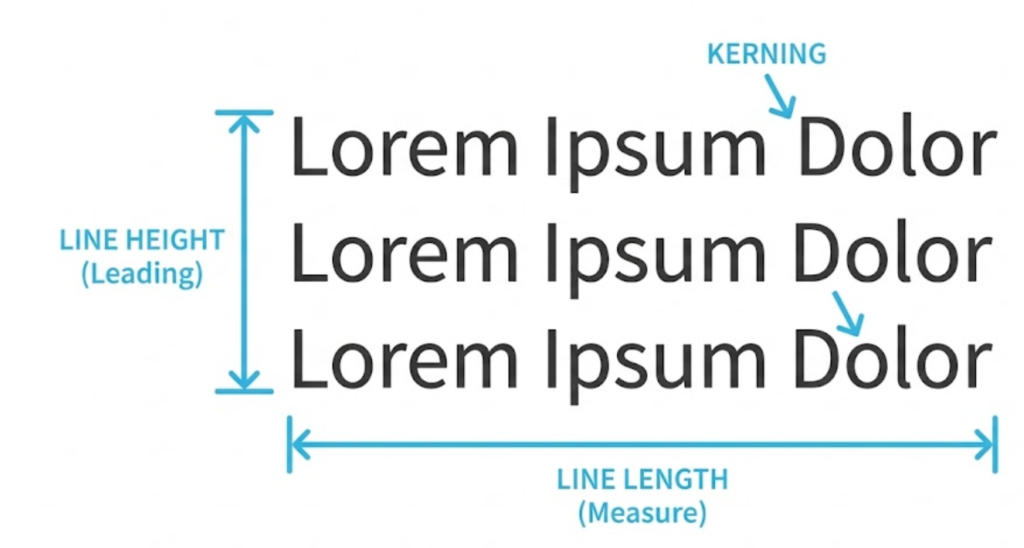
This is the secret to a professional-looking site. Line Height (or leading) is the vertical space between lines of text.
If the lines are too close, the text looks cramped and intimidating. If they are too far apart, the eye gets lost finding the next line.
The Saint Digital Rule: For body text, the line height should be roughly 1.5x the font size. If your font is 16px, your line height should be 24px. This creates “white space” that makes long paragraphs feel easy to absorb.
3. Line Length (The “Tennis Match” Effect)
Have you ever seen a website where the text stretches all the way across a giant 27-inch monitor? It’s awful. Your eye has to travel a huge distance from left to right, and then jump all the way back to find the next line.
The optimal line length for readability is 45 to 75 characters (including spaces). We use layout containers to constrain the text width, ensuring a comfortable reading experience on every device.
4. Color Contrast & Accessibility
This is non-negotiable. Text must stand out from the background.
Light grey text on a white background might look “minimalist” and “chic” to a designer, but it is invisible to a user with visual impairments (or just a cheap phone screen in the sun). We test all our colour combinations against WCAG (Web Content Accessibility Guidelines) standards.
Technical Insight: Web Fonts vs. Performance
When building a site, we have to balance beauty with Page Speed.
- System Fonts (e.g., Arial, Verdana): These are already installed on your computer. They load instantly (0 seconds). They are safe, but boring.
- Web Fonts (e.g., Google Fonts, Adobe Fonts): These are custom files your website has to download. They allow for beautiful, unique branding, but they add weight.
The Risk (FOUT vs. FOIT):
If a web font loads slowly, users might see invisible text for a second (FOIT: Flash of Invisible Text) or see the font snap from a default font to the new one (FOUT: Flash of Unstyled Text).
The Fix: We limit sites to two font families maximum and only load the specific weights we need (e.g., Regular and Bold). We also use modern loading strategies (`font-display: swap`) to ensure text is always visible.
The Takeaway
Typography is the voice of your brand.
It can whisper, it can shout, it can look expensive, or it can look cheap. But most importantly, it dictates whether people will actually read what you have to say.
At Saint Digital, typography isn’t an afterthought. It is a calculated design system. We choose type that is accessible, performant, and perfectly aligned with your brand’s personality.
Ready to make your message clear?
Is your content hard to read?
If your users have to squint to read your text, they won’t buy your product. We at Saint Digital design typographic systems that are beautiful, readable, and accessible. We make sure your message lands every time.
Let’s clear things up.
Learn more from our Glossary
© Saint Digital Ltd, 2020-26, all rights reserved.