
Below the Fold
What is “Below the Fold”? (Where the Sales Pitch Happens)
You’ve hooked the user. Your Hero Section was perfect. They know who you are, and they are interested.
Now comes the hard part. You have to convince them to buy.
To do that, they have to scroll. They have to enter the territory known as Below the Fold.
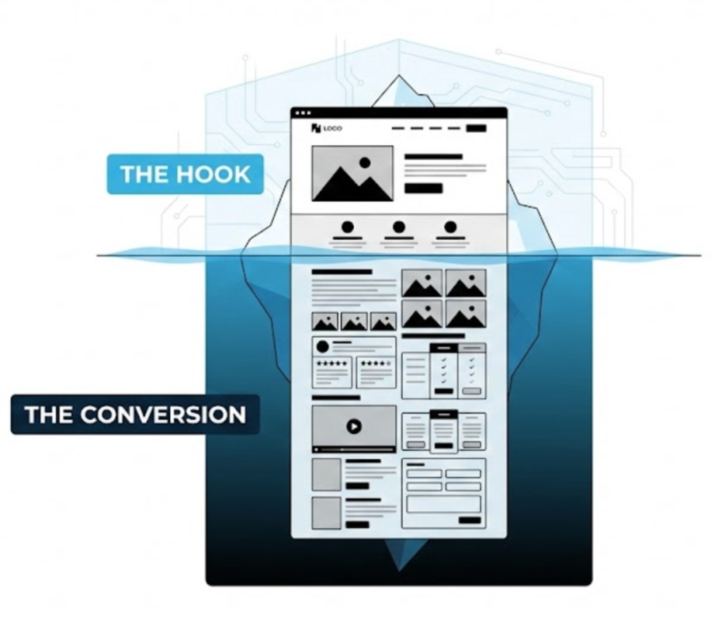
Welcome to the decoder ring. “Below the Fold” refers to the portion of a webpage that is not visible when the page first loads. It is everything you have to scroll down to see.
For years, clients were terrified of this space. “Put it above the fold!” they would scream. “Nobody scrolls!”
At Saint Digital, we know the truth: Everybody scrolls. Studies show that while 80% of attention is spent above the fold, the vast majority of conversions happen below it. The fold is the hook; below the fold is the sales pitch.
User Experience IS SEO.
You can’t separate design from ranking. If your layout frustrates users, your “Dwell Time” drops and your rankings tank. Learn how UX signals impact your visibility in our guide.
The Myth of the “Average” Fold
In 2010, web design was easy. Everyone had the same monitor. In 2025, your users are visiting on iPhones, massive 4K gaming monitors, and tablets. There is no single “Fold.”
- On a mobile, the fold might be after the first paragraph.
- On a 27-inch iMac, the fold might reveal half your homepage.
This means we cannot design for a static line. We must design fluid experiences that encourage scrolling regardless of the device height.
The Psychology of Scrolling (The “Continuance” Principle)
Why do users scroll? Because they are looking for answers. If your Hero Section creates interest, the user has a psychological need to close the “information gap.”
The “Fold” is not a barrier; it is a transition.
Think of it like a first date. Above the fold is the first impression (“Hi, I look nice”). Below the fold is the relationship (“Here are my values”). If you try to cram your life story into the first 3 seconds, you look desperate.
The “False Bottom” Trap
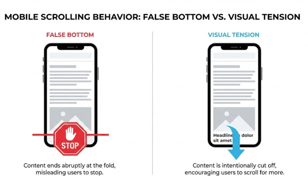
While users will scroll, one design mistake stops them dead: The False Bottom.
This happens when the layout at the “Fold” line looks so complete that the user thinks it is the end of the page (e.g., a huge block of white space or a perfectly fitted full-screen image).
If the user thinks the page has ended, they leave. This is why we design with Visual Tension—deliberately cutting off elements (like text or images) at the bottom of the screen to tease the brain into wanting to see the rest.
What Belongs Below the Fold? (Persuasion Architecture)
Since this is where the user spends their time reading, this is where you put your most convincing assets.
1. The “How It Works” Section
Above the fold, you promised a benefit. Below the fold, you explain the mechanism. Use steps (1, 2, 3) to reduce anxiety.
2. Social Proof (The Trust Builders)
This is where you put detailed testimonials and case study links. Deep Trust is built below the fold.
3. The Secondary CTA
Place a CTA in the middle of the page and at the very bottom. Catch the user the moment they are convinced.
Design Science: The Inverted Pyramid
We borrow this concept from journalism. We structure the page based on attention span:
- Top (Above Fold): The essential “Who/What/Why” (The Headline).
- Middle (Below Fold): The important details and evidence (The Body).
- Bottom (Deep Scroll): Background info and “nice to have” details.
This ensures that even if a user only scrolls halfway, they still get the most critical information.
The SEO Impact of “Below the Fold”
Does Google care about content at the bottom of the page? Yes. Google indexes the entire page.
- Dwell Time: Comprehensive content below the fold improves your Dwell Time, a key signal for Google’s Navboost algorithm.
- Lazy Loading Risks: Be careful with Lazy Loading. If implemented poorly, Googlebot might miss the content below the fold. We ensure all text is loaded in the DOM immediately.
The Takeaway
“Above the Fold” gets the glory, but “Below the Fold” gets the gold.
Your website is a journey. The top is the start; the bottom is the destination. You cannot have one without the other.
At Saint Digital, our web design services engineer the entire scroll experience to guide your user from curiosity to conversion.
Are your users stopping at the top? Let’s get them moving.
Go deeper.
A short page tells a short story. A deep page builds a relationship. We at Saint Digital design long-form, high-conversion layouts that keep users scrolling, reading, and engaging until they are ready to say “Yes.”
Let’s tell the full story.
Learn more from our Glossary
© Saint Digital Ltd, 2020-26, all rights reserved.