
Mobile-First Indexing

What is Mobile-First Indexing? (Why Google Doesn’t Care About Your Desktop Site)
Picture this scenario: You are in a design meeting for your new website. You are looking at a huge, 4K monitor. Your designer presents a stunning, widescreen layout of your new homepage. It has cinematic video backgrounds, complex hover effects, and a beautiful multi-column layout. It looks incredible. You sign it off immediately.
You have just made a critical mistake.
Why? Because Google isn’t looking at that version. Google is looking at the phone version.
Welcome to the decoder ring. Mobile-First Indexing is the single most important operational shift Google has made in the last decade. It changed the fundamental rule of how the search engine works.
In the past, Google’s “spiders” looked at your desktop site to decide where you should rank. The mobile site was just an afterthought. Today, that is completely reversed. Google predominantly uses the mobile version of the content for indexing and ranking.
At Saint Digital, this dictates everything we do. We don’t design for desktop and “squish it down” for mobile. We design for mobile reality, because that is the only reality Google cares about.
Is your site invisible to Google?
If your mobile site has less content than your desktop site, your rankings will suffer. Learn how to audit your site for “Mobile Parity” in our complete technical guide.
The Reality Check: How Googlebot “Sees” You
To understand this, you have to understand how Googlebot (the crawler) works.
Imagine Googlebot is a person visiting your site to grade it. For 20 years, that person sat at a desk with a big monitor. They read your desktop site, indexed those keywords, and ranked you accordingly.
Around 2018, Google realized that most humans were actually using phones. So, they changed Googlebot. Now, Googlebot visits your site pretending to be a smartphone (specifically, an Android device).
Here is the scary part:
If you have a paragraph of text on your Desktop site that explains your services, but you removed that text on your Mobile site to “save space”… Google does not see it.
It doesn’t matter if it’s visible on the desktop version. If it’s not on the mobile version, it effectively doesn’t exist. It won’t be indexed, and you won’t rank for it.
Mobile-First vs. Mobile-Friendly (They Are Not the Same)
This is a common point of confusion among business owners.
- Mobile-Friendly: This is a Usability metric. It means your site “works” on a phone. The text fits on the screen, the buttons are clickable, and you don’t have to pinch-and-zoom.
- Mobile-First Indexing: This is a Ranking system. It means Google is using the mobile data as the primary source of truth for your rankings.
A site can be “Mobile-Friendly” (it looks nice on a phone) but fail at “Mobile-First” (it is missing key content found on the desktop version).
The Trap of “Desktop-First” Design (The Parity Problem)
Many businesses still suffer from “Desktop Vanity.” They fall in love with the big, cinematic experience of the desktop site. To make the mobile version “cleaner,” they start cutting things out:
- “Let’s hide this sidebar on mobile.”
- “Let’s remove this second paragraph so the user doesn’t have to scroll.”
- “Let’s turn this menu into a tiny icon.”
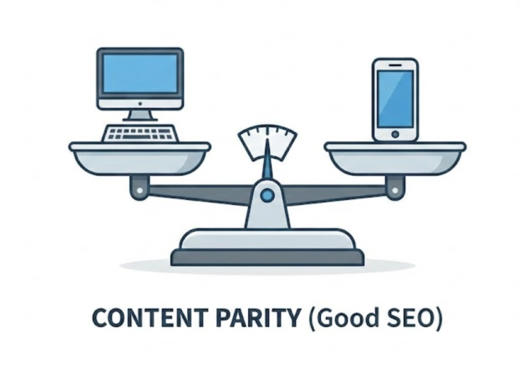
This creates a Lack of Content Parity.
Google explicitly warns against this. If your mobile site has less content, fewer internal links, or less structured data (JSON-LD) than your desktop site, you are actively hurting your SEO.
The Saint Digital Rule: Your mobile site is your site. The desktop version is just an “alternate view” for people with bigger screens.
The Architecture: Responsive vs. Separate Sites
How you build your site determines how easily you survive this shift.
1. Responsive Web Design (The Gold Standard)
This means you have one website (one URL, one set of HTML code) that magically adapts its layout to fit any screen size. Whether viewed on an iPhone or a TV, the content—the text, the images, the links—is exactly the same code. Google loves this because it guarantees parity.
2. Separate Mobile Site (“m.dot”)
In the old days (2010), people built a separate site at m.facebook.com. This is a nightmare for Mobile-First Indexing. You have to maintain two websites, and if you forget to update the mobile one, your rankings tank. We strongly advise migrating away from this.
User Experience: The “Thumb Zone”
It’s not just about content; it’s about interaction. Google measures User Experience (UX) signals.
On desktop, users have a precise mouse cursor. On mobile, they have a clumsy thumb. We design for the “Thumb Zone”—placing critical buttons (like “Buy Now” or “Contact Us”) in the bottom-middle of the screen where it is easiest to reach, rather than the top-left corner which is a “stretch zone.”
Mobile Speed: The 4G Reality
Since Google is looking at your site as a mobile phone, it is also judging your speed as if it’s on a mobile network.
A huge, 4MB image might load instantly on your office fibre broadband. But on a phone with 3 bars of 4G signal? It will take 10 seconds. This kills your Core Web Vitals score.
We optimise specifically for mobile speed. We use “lazy loading,” next-gen image formats (WebP), and minified code to ensure the site flies even on a slow connection.

How to Check Your Mobile Parity
Google tells you exactly what it sees. You can use Google Search Console to check.
- Go to “Settings” in GSC.
- Look for “Indexing Crawler.” It should say “Googlebot Smartphone.”
- Use the “URL Inspection” tool. Enter a page on your site.
- Click “View Crawled Page.” This shows you the *code* Google saw. If your content is missing from that code, Google isn’t indexing it.
The Takeaway
Mobile-First Indexing isn’t a “setting” you turn on. It is the reality of the modern web.
It means we have to stop treating mobile users as “second-class citizens” who get a “lite” version of the website. They are your primary users, and they deserve the full experience.
At Saint Digital, our web design services are “Mobile-Up.” We ensure your most important content and call-to-actions are perfect on the smallest screen first. Then, we expand the layout for desktop.
This ensures that no matter where your customer is—or what device Googlebot is using—your site is ready to rank.
a
Don’t design for desktop. Design for Google.
If your mobile site is a “lite” version of your desktop site, you are invisible to Google. We at Saint Digital design responsive, mobile-first experiences. We ensure your site looks beautiful on a 27-inch monitor but ranks like a champion on a 5-inch phone.
Let’s build for the device that matters.
Learn more from our Glossary
© Saint Digital Ltd, 2020-26, all rights reserved.