
Navigation
What is Website Navigation? (And Why “More” Is Not Better)
Imagine walking into a massive supermarket to buy milk. But when you walk in, there are no aisle signs. There is no logic. The milk is next to the car tyres, and the bread is hidden behind the shampoo.
How long do you stay? You don’t. You leave immediately and go to the shop next door.
This is exactly what happens on a website with poor Navigation.
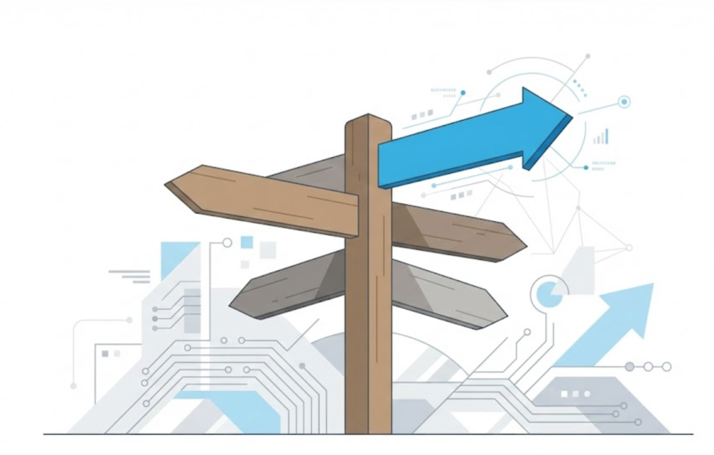
Welcome to the decoder ring. Navigation is not just “the menu at the top.” It is the Information Architecture (IA) of your entire digital existence. It is the map, the signposts, and the logic that allows users (and Google) to move through your site without getting lost.
At Saint Digital, we believe that navigation is the single biggest factor in User Experience (UX). The golden rule of web design is simple: Don’t Make Me Think. If a user has to pause and puzzle out where to click, you have already lost them.
Lost users don’t buy.
Poor navigation sends users running to the back button. Learn how to structure your site’s architecture for maximum retention and ranking power in our complete guide.
The Psychology: The “Paradox of Choice”
A common mistake business owners make is wanting to put everything in the menu. “We offer 20 services, so let’s put 20 links in the header!”
This is a conversion killer. It triggers a psychological phenomenon called The Paradox of Choice (or “Decision Paralysis”).
When humans are presented with too many options, we freeze. We get overwhelmed. We choose nothing.
Miller’s Law suggests that the human brain can only hold about 7 items (plus or minus 2) in its working memory. If your menu has 15 items, you are literally overloading your customer’s brain bandwidth.
Why Navigation is Critical for SEO (The “Crawl” Factor)
Your users aren’t the only ones using your menu. Google is, too.
As we discussed in our Indexing article, Googlebot is a crawler. It discovers content by following links. Your main navigation menu is the primary highway for Googlebot.
The “Champagne Tower” Analogy (Link Equity)
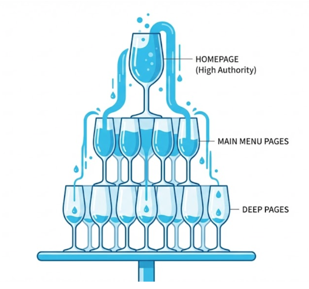
Imagine a champagne tower. The top glass is your Homepage. It holds the most liquid (Authority or “Link Equity”).
When you link to a page in your main menu, you are placing a glass directly underneath the top one. The authority flows straight down into it. If a page isn’t in the menu (or is buried 5 clicks deep), it sits at the bottom of the table, getting only a tiny drop of champagne.
Strategic Navigation ensures your most profitable pages are “top tier” glasses, receiving the maximum SEO power from the homepage.
The 4 Main Types of Navigation
We choose the right tool for the job based on the complexity of the site.
1. The Standard Horizontal Menu
What it is: A simple row of 5-7 links at the top (Home, About, Services, Blog, Contact).
Best for: Small to medium businesses with a clear, simple offering.
Why we like it: It is familiar. Users know exactly how to use it. It doesn’t try to be clever; it tries to be helpful.
2. The Mega Menu
What it is: A large, drop-down panel that appears when you hover over a link. It can contain columns, images, and dozens of sub-links.
Best for: Large e-commerce sites (like Amazon) or big B2B companies with many distinct services.
3. The Hamburger Menu
What it is: The three little horizontal lines (≡) that you click to expand the menu.
Best for: Mobile devices. It is the standard for Mobile-First design.
4. Faceted Navigation (Sidebar)
What it is: A sidebar (usually on the left) that lets users filter products (e.g., “Filter by Size,” “Filter by Colour”).
Best for: E-commerce category pages. This is powerful for SEO if handled correctly, but can cause “Duplicate Content” issues if not technically managed.
Technical Concept: Flat vs. Deep Architecture
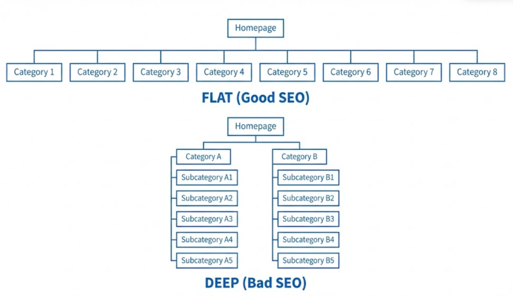
This refers to Click Depth. How many times does a user have to click to get from the Home Page to your deepest product page?
- Deep Architecture (Bad): Home > Services > Design > Web > WordPress > Product. (5 Clicks). This buries pages where Google can’t find them.
- Flat Architecture (Good): Home > Web Design > Product. (2 Clicks).
The Saint Digital Rule: No important page should ever be more than 3 clicks away from the homepage.
The “Breadcrumb”: The Unsung Hero
There is one other navigation element we always include: Breadcrumbs.
These are the little links at the top of a page that look like this:
Home > Services > Web Design > E-Commerce
They act like Hansel and Gretel’s breadcrumbs. They show the user exactly where they are in the site hierarchy and give them a one-click way to go back a step. Google loves breadcrumbs and often displays them in the search results instead of the ugly URL. We use Schema Markup to ensure Google understands them.
Common Navigation Mistakes
Here are the traps we see clients fall into during our audits:
Mistake 1: Mystery Meat Navigation
Using vague, clever, or internal jargon for labels.
Example: “Solutions,” “Synergy,” “Our Way.”
The Fix: Be boringly descriptive. Use keywords. “Plumbing Services,” “Digital Marketing,” “Our Process.” Users (and Google) scan for keywords, not riddles.
Mistake 2: The “Format-Based” Trap
Organizing content by format rather than topic.
Example: A menu with “Videos,” “PDFs,” “Podcasts.”
The Fix: Users don’t search for formats; they search for answers. Organize by topic: “SEO Guides,” “Web Design Tips,” regardless of whether the answer is a video or text.
Mistake 3: Ignoring the Footer
The footer is the safety net. When a user scrolls to the bottom and hasn’t found what they want, they look at the footer.
The Fix: We use the “Fat Footer” strategy. We include the “boring but necessary” links (Privacy Policy, Terms) but also repeat the main navigation links to save the user from scrolling back up.
The Takeaway
Navigation isn’t about fitting everything in. It’s about deciding what to leave out.
Great navigation is invisible. When it works, the user doesn’t notice it; they just find what they need. When it fails, it’s the only thing they notice.
At Saint Digital, we are information architects first and designers second. Our web design services involve mapping out your site structure before we draw a single pixel, ensuring every page is easy to find, logical to navigate, and perfectly signposted for Google.
Ready to build a site that users can actually use?
Don’t let your customers get lost.
If users can’t find it, they can’t buy it. We at Saint Digital build logical, intuitive, and SEO-friendly site architectures. We turn messy sitemaps into clear pathways that guide your users straight to the checkout.
Let’s build a better map.
Learn more from our Glossary
© Saint Digital Ltd, 2020-26, all rights reserved.