
Viewport

What is the Viewport? (The “Window” That Controls Your Layout)
Have you ever opened a website on your phone, but the text was tiny and unreadable? You had to pinch and zoom just to read the headline.
That website wasn’t broken. It just didn’t have a configured Viewport.
Welcome to the decoder ring. The Viewport is the user’s visible area of a web page. Think of it as the “frame” through which they view your content.
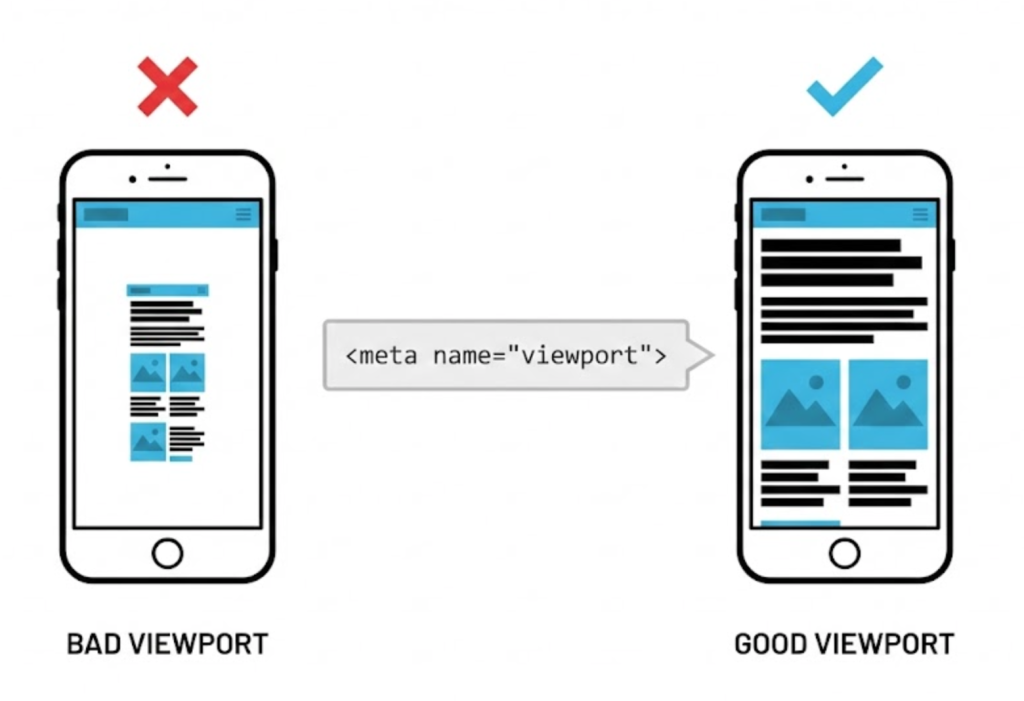
On a desktop computer, the viewport is huge (the size of the browser window). On a mobile phone, the viewport is tiny. Without specific instructions, a mobile phone will try to cram the entire desktop site into that tiny window, shrinking everything down to microscopic size.
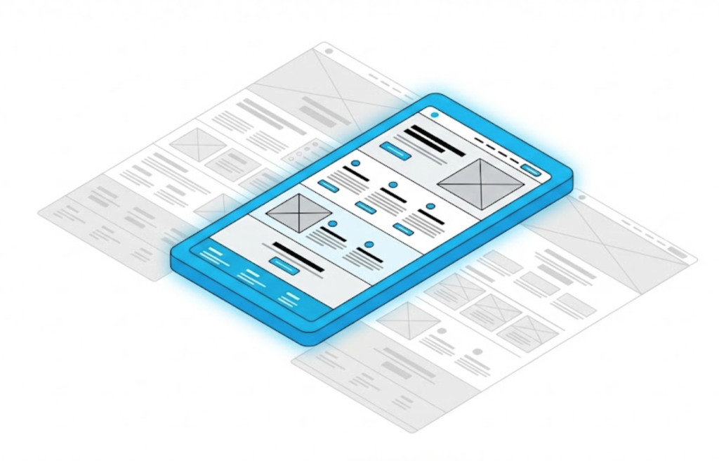
At Saint Digital, controlling the viewport is Step 1 of Responsive Web Design. It is the code that tells the browser: “Don’t shrink this page; adapt it.”
Is your site failing on mobile?
If your viewport isn’t configured, Google considers your site “Not Mobile Friendly” and will drop your rankings. Learn how to fix mobile usability issues in our technical guide.
The Magic Line of Code: The Meta Viewport Tag
To control the viewport, we place a specific tag in the <head> of your HTML code. It looks like this:
<meta name="viewport" content="width=device-width, initial-scale=1">
This might look like gibberish, but it gives the browser two critical commands:
1. “width=device-width”
This tells the browser: “Set the width of the content to match the width of the screen.”
If the user is on an iPhone (390px wide), the website becomes 390px wide. If they are on a massive gaming monitor, it expands. This forces the content to reflow naturally rather than shrinking.
2. “initial-scale=1”
This sets the zoom level to 1:1. It prevents the phone from zooming out automatically when the page loads, ensuring your text is legible instantly.
Why Viewport is Critical for SEO
Viewport configuration isn’t just a design choice; it is a ranking factor.
Since Google moved to Mobile-First Indexing, it crawls the mobile version of your site first. If Googlebot finds a page without a viewport tag, it flags the page as “Not Mobile Friendly.”
In Search Console, this error appears as: “Content wider than screen” or “Text too small to read.” This is a direct penalty signal that can hurt your visibility.
The “Fixed Width” Trap
In the old days of the web (circa 2010), designers built sites with “Fixed Widths.”
They would code a site to be exactly 980 pixels wide. This was fine when everyone used bulky desktop monitors. But today, if you force a 980px website onto a 390px phone screen, you create a horizontal scrollbar. The user has to scroll left and right just to read a sentence.
The Saint Digital Rule: Never use fixed widths. We use relative units (like percentages or vw – viewport width) to ensure elements are fluid.
Viewport Units: A Design Superpower
Modern CSS allows us to size elements based on the viewport itself. This creates stunning, immersive designs.
- 100vh (Viewport Height): This makes a section (like your Hero Section) fill exactly 100% of the user’s screen height, no matter what device they are on.
- 100vw (Viewport Width): This makes an element span the full width of the browser, edge-to-edge.
The Takeaway
The Viewport is the canvas upon which your website is painted.
If you ignore it, you are asking users to look at a postage stamp. If you optimise it, you are giving them a native, app-like experience.
At Saint Digital, our web design services are built on a “fluid-first” philosophy. We ensure your site looks perfect whether it’s viewed on a smart watch or a smart TV.
Is your website squeezing your content? Let’s give it some space.
Is your mobile experience broken?
If your users have to pinch, zoom, or squint, they are leaving. We at Saint Digital build fully responsive websites that adapt perfectly to every viewport. We ensure your code is Google-compliant and your user experience is seamless.
Let’s make your site mobile-ready.
Learn more from our Glossary
© Saint Digital Ltd, 2020-26, all rights reserved.