
Above the Fold
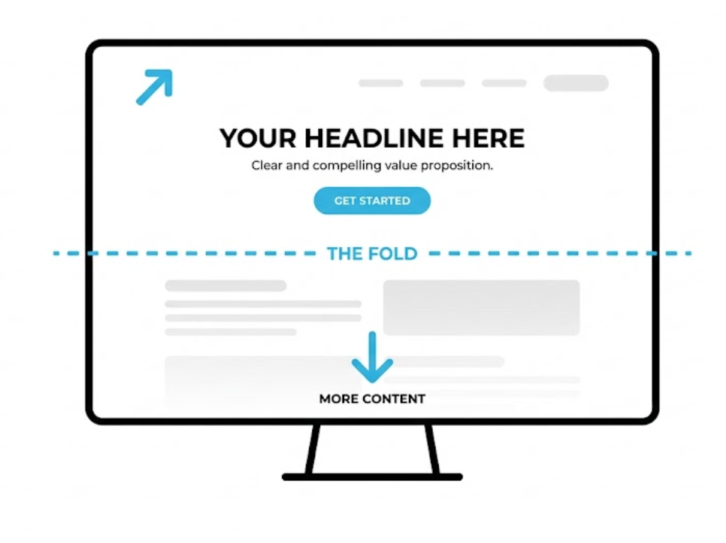
What is “Above the Fold”? (And Why the “No Scrolling” Myth is Wrong)
There is no “rule” in web design that has caused more arguments, cluttered more homepages, and been more misunderstood than the concept of “Above the Fold.”
You’ve probably heard it in a meeting. “We need to get this above the fold!” “No one is going to scroll!”
This idea—that anything “below the fold” is a digital graveyard where content goes to die—is one of the oldest myths in web design. And here is the spoiler: it is wrong.
But… and this is a very important “but”… the fold is still one of the most critical pieces of real estate on your entire website.
So, what’s the real story? Is it a myth or is it a rule? Welcome to your decoder. At Saint Digital, this is one of our favourite topics, because it’s where psychology, design, and SEO all collide.
Is your layout hurting your rankings?
What happens “above the fold” directly impacts your Core Web Vitals and loading speed. If you want to ensure your site isn’t just pretty, but also technically fast, you need to look under the hood. Learn how in our technical guide.
First, What is “The Fold”? (The Newspaper Analogy)
The term “Above the Fold” doesn’t come from the web. It comes from old-school, ink-on-paper newspapers.
When a broadsheet newspaper is folded in half and stacked in a newsstand, the only thing you can see is the top half. Editors knew they had one chance to sell that paper. They had to put their biggest headline and best photo in that top-half space.
When the web came along, we copied the same logic. The “fold” became the bottom of your computer screen. The myth was born: if it’s not visible on the screen when the page first loads, users will never see it.
The Myth Debunked: Users Love to Scroll
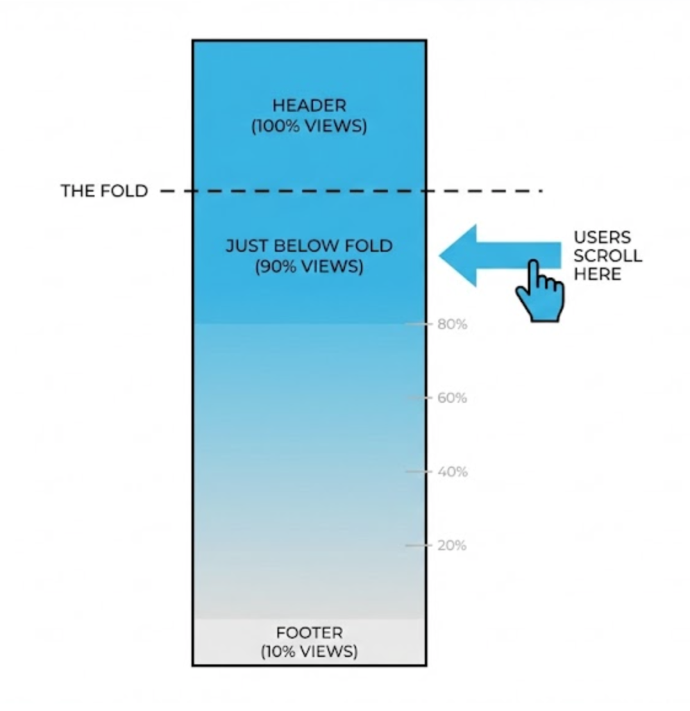
Here’s the thing: the myth was probably true in 1998. But in 2025, scrolling is a 100% natural, subconscious action.
Think about your own behaviour. You don’t just stare at the top of a webpage. You land, you orient, and you scroll. The invention of the smartphone and “infinite feeds” (Instagram, TikTok) have trained our thumbs to scroll instantly.
We use tools called Heatmaps to track user behaviour. They overwhelmingly show that users start scrolling within seconds. Cramming everything above the fold leads to cluttered, ugly designs.
BUT… Why Google Does Care About the Fold (The SEO Part)
Okay, so users scroll. The myth is dead. The fold is irrelevant, right? Wrong.
The “fold” is no longer a container for all your content, but it is still your first impression. And Google has very specific rules about it.
1. The “Page Layout” Algorithm
Google wants to give users a good experience. The Page Layout Algorithm (often called “Top Heavy”) penalises websites that have too many ads “above the fold.” If a user has to scroll past a giant banner ad just to find the article, Google will lower your rankings.
2. Core Web Vitals (LCP)
This is the technical side. Google measures LCP (Largest Contentful Paint). This metric asks: “How fast does the biggest element above the fold load?” If your “above the fold” area is packed with a massive uncompressed video, your LCP score will be terrible.
The “False Bottom” Danger
While users do scroll, you have to give them a reason to.
A False Bottom is a design mistake where the content ends perfectly at the fold line (e.g., a solid colored box that touches the bottom of the screen). This creates an optical illusion that the page has ended. The user thinks, “Oh, that’s it,” and leaves.
The Fix: We always ensure elements “straddle” the fold. A cut-off image or a peek of the next paragraph subtly hints to the user: “There is more down here. Keep going.”
The “Saint Digital” Approach: The Fold as a Handshake
We treat the fold as a Handshake. It has one job: to answer the user’s question: “Am I in the right place?”
We use the “above the fold” area (your Hero Section) to do two things only:
- Deliver the Value Proposition: A clear, powerful headline that explains exactly what you do.
- Provide the Next Step: A single, clear CTA button.
The Mobile Complication: There is No “Fold”
Here is the final nail in the coffin for the “fold” myth: There is no single “fold” line.
Your users are visiting on iPhones, Androids, iPads, and giant desktop monitors. Every single one has a different screen height. Because of this variance, it is technically impossible to design a “perfect” above-the-fold layout for everyone.
The Takeaway
The “fold” isn’t a brick wall. It is the start of a conversation.
Don’t let anyone tell you to “cram it all above the fold.” That creates a bad User Experience and hurts your SEO.
At Saint Digital, our web design services design for the scroll. We hook the user instantly with a fast, clear, and compelling top section, and then we guide them seamlessly down the page. We trust your users to use their thumbs.
Ready to make a great first impression?
Make your first 3 seconds count.
You have a tiny window to grab a user’s attention. If your “above the fold” area is cluttered or slow, you lose them. We at Saint Digital design high-impact hero sections that hook visitors instantly and encourage them to explore your brand.
Let’s fix your first impression.
Learn more from our Glossary
© Saint Digital Ltd, 2020-26, all rights reserved.