
Whitespace
What is Whitespace? (Why “Empty” Space is Your Most Powerful Design Element)
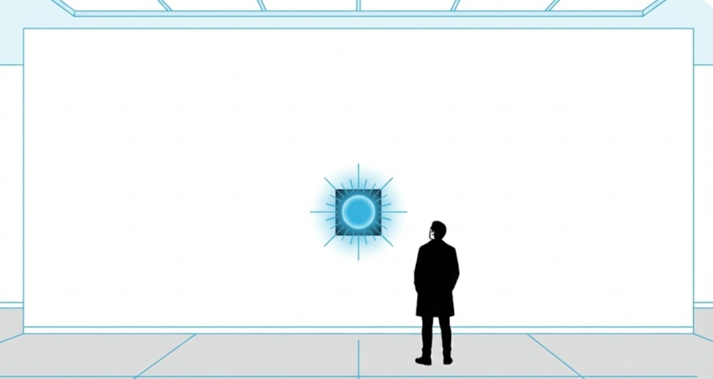
Imagine walking into a luxury boutique. There are only three dresses on the rack. The floor is open. The lighting is soft. It feels expensive.
Now imagine walking into a discount warehouse. Clothes are piled high in bins. The aisles are cramped. Posters cover every inch of the wall. It feels cheap.
The difference isn’t the clothes. It is the Space.
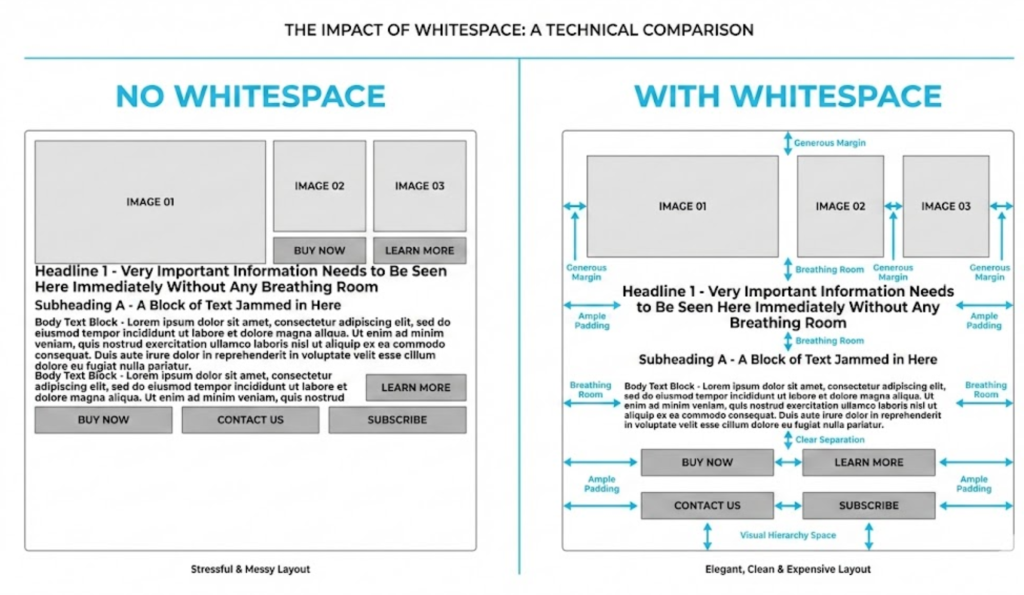
Welcome to the decoder ring. Whitespace (or Negative Space) is the empty space between and around the elements of a design. It is the margins, the padding, and the gutters that separate text, images, and buttons.
Clients often see whitespace as “wasted real estate.” At Saint Digital, we see it as an active design element. It is the oxygen that allows your content to breathe. Without it, your message suffocates.
Is your design suffocating your message?
Cluttered websites overwhelm users and skyrocket bounce rates. Learn how to use layout, spacing, and UX principles to keep visitors engaged in our SEO guide.
The Two Types of Whitespace
Whitespace isn’t just one thing. We use it at two different scales to control the user experience.
1. Macro Whitespace (The Layout)
This is the big stuff. It’s the space between major layout elements.
Examples: The margins to the left and right of the main content; the gap between the Hero Section and the services list; the space around your logo.
The Job: Macro whitespace guides the eye. It tells the user where one section ends and another begins. It creates a sense of calm and order.
2. Micro Whitespace (The Details)
This is the tiny stuff. It’s the space between lines of text (Line Height), the space between list items, and the space between a button’s text and its edge (Padding).
The Job: Micro whitespace improves Legibility. If your lines of text are squashed together, the brain has to work harder to separate them. Adding micro space makes reading effortless.
Why Whitespace Increases Conversions (The Psychology)
You might think, “If I have more space, I have less room to sell.” Actually, the opposite is true. Whitespace focuses attention.
1. It Reduces Cognitive Load
Hick’s Law states that the more options a user has, the longer it takes them to decide. A cluttered page is a mental burden. By removing clutter and surrounding your key message with whitespace, you remove distractions. When there is only one thing to look at, the user looks at it.
2. It Makes CTAs Pop
How do you make a Call to Action (CTA) stand out? You don’t need to make it flashing red. You just need to give it room. If you place a button in the middle of a busy paragraph, it disappears. If you place a button in the center of a large white section, it becomes a magnet.
3. The “Luxury” Effect
We associate emptiness with luxury. Apple, Rolex, Tesla—their websites are defined by what they don’t show. They use massive amounts of whitespace to say: “Our product is so good, it speaks for itself.” Clutter implies “discount.” Space implies “value.”
Design Science: The Law of Proximity
There is a Gestalt principle called the Law of Proximity. It states that items close together are perceived as a group.
We use whitespace to group information logically. If a headline, image, and paragraph are close together (with whitespace surrounding them), the user instantly knows they belong together. If the spacing is uneven, the user gets confused. Whitespace is the invisible glue that holds your structure together.
The “Above the Fold” Battle
The biggest enemy of whitespace is the myth of Above the Fold.
Clients often say: “Can we squeeze the text up? I want the user to see the About Us section without scrolling.” Do not do this.
If you cram everything to the top, you create a “Data Wall.” The user lands, feels overwhelmed by the density of information, and bounces (Bounce Rate). It is better to have a spacious, inviting Hero section that encourages scrolling than a cramped, busy top section that encourages leaving.
Mobile Whitespace: A Different Beast
On a desktop monitor, we have luxury space. On a mobile phone, we have vertical space.
Mobile whitespace is even more critical because touch screens are inaccurate. The “Fat Finger” Rule: If your buttons are too close together (lack of whitespace), users will accidentally click the wrong one. We ensure that every interactive element has enough “breathing room” to be tapped easily without frustration.
The Takeaway
Whitespace is not “nothing.” It is the frame that makes the picture visible.
It is an active design decision that improves readability, comprehension, and conversion. It turns a chaotic website into a guided journey.
At Saint Digital, our web design services defend whitespace fiercely. We don’t fill gaps just because they are there. We use space to direct your customer’s eyes exactly where we want them to go.
Is your website feeling cramped? Let’s give it some room to breathe.
Stop the Clutter.
A crowded website confuses customers. A clean website converts them. We at Saint Digital are experts in user-centric design. We use whitespace strategically to create premium, high-performance layouts that guide users effortlessly to the checkout.
Let’s clean up your design.
Learn more from our Glossary
© Saint Digital Ltd, 2020-26, all rights reserved.